Tips for Quality Artwork
Follow these guidelines to help students create quality artwork. Your sales will increase, products will look great, and parents will be pleased!
If your organization is not able to implement the guidelines below, your time will be wasted and your fundraiser will be unsuccessful.
Do the Following
DO
Visit our Pinterest Boards to find many great art lessons and videos. https://www.pinterest.com/kidskreations/
DO
Incorporate your organization’s existing art curriculum objectives into your Kids Kreations Fundraiser. This ensures efficiency, no loss of class time - all while raising valuable funds! Examples - Jim Dine, Eric Carle, Georgia O'Keefe

DO
Have an organized, directed, age-appropriate art lesson for each class. Have one class create the same art lesson. Select a separate art lesson for another class. This makes it easy for the art teacher to have more control in directing and guiding the art creation experience - resulting in significantly higher quality artwork.
DO
Use paper sized 8.5” x 11” supplied by your Kids Kreations Art Fundraiser package OR your choice of 8.5” x 11” non lined paper - any color. Cardstock thickness works best.
DO
Ensure that each child creates an attractive piece of art that both students and parents will enjoy. Great Artwork equals Great Sales!
BEST SELLERS - Bold, colorful flowers, landscapes, butterflies, birds, sailboats and more at http://www.pinterest.com/kidskreations/best-selling-artwork/

For youngers- implement handprints, footprints and fingerprints made into full page art: http://www.pinterest.com/kidskreations/handprint-footprint-and-fingerprint-art

DO
Have the artist work out basic composition onto the drawing paper first. Use the pink eraser at the tip of a #2 pencil. Lightly pencil over the eraser marks, wipe off the eraser marks and proceed - tip from http://www.teachkidsart.net
DO
Fill up the entire 8.5” x 11” drawing paper with large, bold color and images!
Draw big so that details are not lost during processing. Many keepsake products require artwork to be shrunk down. Use the paper in a horizontal or vertical position.

DO
Use bold colored markers, paints, medium to darker watercolors, oil pastels and paper collages. Erase pencil marks.
DO
Create artwork that evokes an emotional response from a parent or loved one - making the artwork irresistible for purchase!

DO
Ask the artist to sign his/her name and date on the artwork at least 1/2 inch away from the edge of the drawing paper. Parents enjoy seeing their child’s name and year on the artwork and your sales will increase.

DO
Make sure the artist’s name, grade and teacher are written legibly on the back of each artwork. Check to see if identification labels have been provided for your students. Write the word “TOP” on the back of artwork if the orientation is ambiguous.
AVOID THE FOLLOWING
DON’T
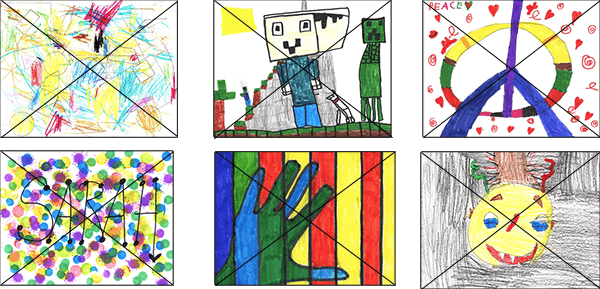
Don’t use colored pencils, crayons, light watercolor, fluorescents, metallics, stamp pads or glitter. Light colored artwork processes very poorly onto the products. Glitter appears as brown dots on the products.

DON’T
Don’t leave much white or void space on the paper. Big, bold, colorful artwork sells best and looks vibrant on all products!

DON’T
Don’t write names or words near edge of paper. Do add color extending to the edge of the paper.

DON’T
Don't create white borders, thin borders, or pencil borders. Extend color to the edge of paper.

DON’T
Don’t send unfinished artwork.

DON’T
Don’t send scribbled drawings.

DON’T
Don’t send the following - Abstract art , self portraits, monsters, shoes, letters, names, holiday, peace signs, robots, line art and hand art. If you implement any of these art themes, your sales will be very poor, your time and effort will be wasterd, and you will risk damaging your art teacher’s professional reputation. Again, view our Pinterest Boards for assistance with great art!

DON’T
Don’t draw or trace copyrighted items like Spiderman, Mickey Mouse, Hulk, video game images, etc. Don’t use stamps, stickers or coloring pages. We can’t legally reproduce copyrighted images. Such artwork will be returned without processing.
DON’T
Don’t submit artwork without student’s name, grade and teacher written on the back of each work of art. Don’t use a dark marker to write the information on the back of the artwork; the marker will bleed through, appearing on front image.


 or Vertical